Shrelo Digital Market Technology Logo & Brand Identity Logo Design

As a specialist in brand identity and logo design, I am aware of the importance of a well-designed logo in capturing the spirit and core values of a business. It is critical to develop a logo and brand identity for Shrelo Digital Market Technology that communicate professionalism, innovation, and dependability.
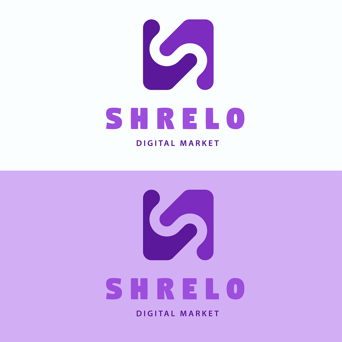
The sleek, stylized letter “S,” which serves as the logo’s primary component and signifies Shrelo’s dominant position in the digital market, is used to denote the company’s presence. Clean, contemporary lines are used to represent innovation and forward-thinking, demonstrating Shrelo’s dedication to remaining at the cutting edge of technical breakthroughs. Electric blue and brilliant orange are just two examples of the bold and vibrant colors used in the color scheme to convey a sense of excitement and motion.
The Shrelo Digital Market Technology brand identity complements the logo and further improves the company’s image. The brand identity uses a carefully chosen combination of typefaces, colors, and visual components to give Shrelo’s target market a unified and memorable experience.


- Typography: To help convey professionalism and clarity, we’ve gone for a contemporary sans-serif font. It adds a touch of elegance while ensuring legibility across all media thanks to its clear lines and proportions. This font and the logo work in perfect harmony to strengthen Shrelo Digital Market Technology’s overall brand identification.
- Color Scheme: The Shrelo Digital Market Technology color scheme combines bright, vivacious hues that give a sense of dependability and activity. The dominant hue, electric blue, stands for reliability, sturdiness, and knowledge. Bright orange accents, which stand for innovation, inventiveness, and zeal, balance everything out. Together, these hues provide a striking visual impact and communicate Shrelo’s dedication to providing innovative solutions for the digital market sector.

- Visual components: To further strengthen the brand identity, we have added understated visual components motivated by connectivity and technology. These design cues, including the streamlined lines and connected nodes, reflect Shrelo’s emphasis on growth, collaboration, and seamless integration within the context of the digital market landscape. These illustrations serve as a visual shorthand for the principles and domain knowledge of Shrelo.
The company’s professionalism, ingenuity, and dependability are all represented by the Shrelo Digital Market Technology logo and corporate design. We have developed a unified and aesthetically pleasing brand design that appeals to Shrelo’s target market through the thoughtful selection of typeface, colors, and visual components. The company’s ideals will be powerfully reflected in the logo and brand identity, ensuring a strong and enduring presence in the digital market sector.
Latest Client Review
Absolutely wonderful service. From start to end was very persevering and their inspired mind create it easy to work with their and get the effects we were looking for. Thanks and cannot endorse enough!
